
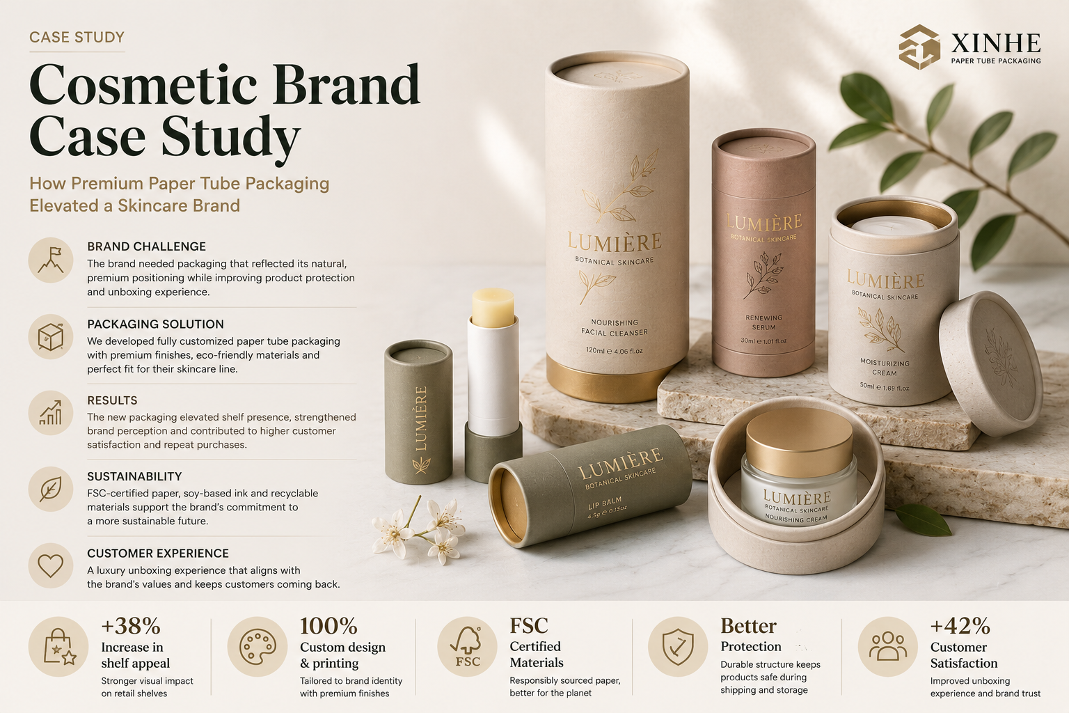
The first physical interaction
Packaging became part of the product’s value story.
Packaging is often the first physical interaction a customer has with a cosmetics brand — before the product itself, before the ingredient list, before the price tag.
For one independent skincare brand launching a premium facial serum line, that first impression was the entire problem. This case study walks through how switching from a standard plastic box to a custom paper tube transformed both the unboxing experience and the brand’s positioning in a crowded retail category.
01 · The challenge
A premium formula in generic packaging.
The brand — a small-batch skincare label launching three serums targeting different skin concerns — came to packaging development with a familiar set of constraints. Their original concept used a rigid plastic outer box, similar to what most mid-range serum brands already use. Early buyer feedback was blunt: the packaging looked generic, didn’t photograph well for social media, and gave no visual cue that the product inside was a premium, small-batch formulation. Retail buyers evaluating the line for boutique beauty stores specifically flagged the packaging as a barrier to a higher shelf price point.
- Signal a premium, artisanal positioning at a glance
- Stand apart visually from the wall of rectangular boxes typical in the serum category
- Support a sustainability message, since the brand’s formulations were already marketed as clean and eco-conscious
- Stay within a per-unit cost that worked for a small-batch production run
02 · The solution
A two-piece tube, considered down to the touch.
Working through the customization process, the brand moved to a two-piece kraft paper tube with a friction-fit paperboard cap — replacing the plastic box entirely. Several specific choices made the format work for a cosmetics application:
Engineered around the bottle
Diameter and height engineered around the bottle. Rather than using an off-the-shelf tube size, the dimensions were built around the exact serum bottle, with a snug foam disk insert at the base to prevent movement during shipping. This eliminated the “rattling box” feeling that cheapens a premium product’s perceived quality.
Matte soft-touch finish
A matte soft-touch finish on the body. Instead of glossy lamination, the brand chose a matte soft-touch coating, which gives the tube a tactile, almost fabric-like feel in hand — reinforcing the “premium skincare” cue before the customer even opens it.
Foil-stamped cap
Foil-stamped branding on the cap. Rather than printing the full logo across the tube body, the brand used a small, gold foil-stamped emblem centered on the flat top cap — a minimalist design choice that reads as high-end and photographs cleanly for product shots and social content.
Natural kraft left visible
Kraft-brown body left partially unprinted. Rather than covering the entire tube in ink, large sections of the natural kraft paper were left visible, visually communicating the sustainability story without needing an explicit “eco-friendly” callout on the label.
A recyclable structure
A recyclable, single-material structure. Because the tube, cap, and internal insert were all paperboard-based (no plastic film laminate, no separate plastic insert), the brand could accurately market the packaging as fully recyclable — a claim their previous plastic box couldn’t support.
The sampling process
The finish had to be felt, not just seen.
Before committing to a production run, the brand requested a small batch of physical samples in three finish variations: full-gloss print, matte soft-touch, and an uncoated raw kraft option. Testing these in hand — rather than relying on digital mockups — proved decisive. The matte soft-touch version consistently tested best with the brand’s target customers in informal feedback sessions, confirming a choice that looked close on screen but felt noticeably different in person. This step is one that’s easy to skip under launch deadlines, but it directly shaped the final decision.
04 · The results
A stronger position on shelf and in hand.
After switching to the custom tube packaging:
Higher retail tier
Retail buyers approved the line for boutique placement at a higher price tier than the original plastic-box version had been quoted for.
Better organic content
Unboxing content performed better organically on social platforms, with the tactile matte finish and minimalist gold cap frequently mentioned in customer posts and reviews.
Fewer shipping issues
Return and damage rates from shipping dropped, attributed to the tighter foam-insert fit inside the tube compared to the looser original box.
Substantiated sustainability
The brand could substantiate its sustainability claims with a fully recyclable, single-material package — something increasingly scrutinized by both retailers and consumers.
05 · Key takeaways
What other cosmetics brands can apply.
Build around the product
Build dimensions around the actual product, not a generic tube size — fit is what eliminates the “cheap, rattling” feeling.
Let finish carry the signal
Finish choice carries as much brand signal as the printed design. Matte soft-touch, foil stamping, and deliberate use of unprinted kraft paper can communicate positioning more effectively than dense graphics.
Compare physical samples
Request physical samples in multiple finishes before finalizing — screen mockups rarely predict how a finish will feel and photograph in hand.
Keep material single-stream
Keep the material single-stream where possible. Recyclability claims hold up better — and cost less to verify — when the tube, cap, and inserts are all paper-based.
The underlying point
More than an alternative to a box.
For any cosmetics brand weighing packaging formats for a premium or clean-beauty line, this case makes the underlying point clear: a well-engineered paper tube isn’t just an alternative to a box — it can become part of the product’s value story.